
A maintenance team can leave a morning planning meeting with a long list of pump failures and still have no defensible answer to a simple question: which failure mode deserves attention first? Counting work orders helps, but it can also send the team toward frequent, low-consequence leaks while a less common coupling or impeller problem causes the longest production interruption.
A Pareto chart turns that uncertainty into a ranked view of a selected loss. It combines descending bars with a cumulative-percentage line, helping reliability engineers connect CMMS records to a practical equipment-priority plan. The method is straightforward, but the result is only as reliable as the metric, categories, time window, and source data behind it.
Table of Contents
- Why Pareto Analysis Matters for Equipment Reliability
- Define the Metric and Failure Categories
- Clean the Data and Calculate Cumulative Impact
- Build the Pareto Chart in Your Preferred Tool
- Interpret Priorities and Plan Corrective Actions
- Avoid Common Pareto Chart Pitfalls
- Turn the Analysis into Reliability Improvements
Why Pareto Analysis Matters for Equipment Reliability
A process plant may have recurring centrifugal-pump failures across seal leakage, bearing damage, coupling wear, lubrication problems, instrumentation trips, and impeller damage. The CMMS work orders can show seal leakage as the most frequent event. That result may support seal inspection or condition monitoring, while a less frequent impeller problem keeps the pump unavailable much longer and deserves outage planning.
A Pareto chart ranks the categories behind a selected loss. Each bar represents the magnitude of one category, such as failure count, downtime hours, repair hours, or maintenance cost. A cumulative line shows how much of the selected effect those categories explain together. The standard layout uses descending bars and a cumulative scale from 0 to 100%, so the team can see whether a small group accounts for most of the measured loss. Juran's explanation of Pareto analysis connects the method with Vilfredo Pareto's observation from late-19th-century wealth data in Italy, where approximately 80% of the country's wealth was controlled by about 20% of the population. Joseph Juran later generalized that relationship for quality management in the 1940s.

The selected effect determines the priority
Build separate charts when the decision changes:
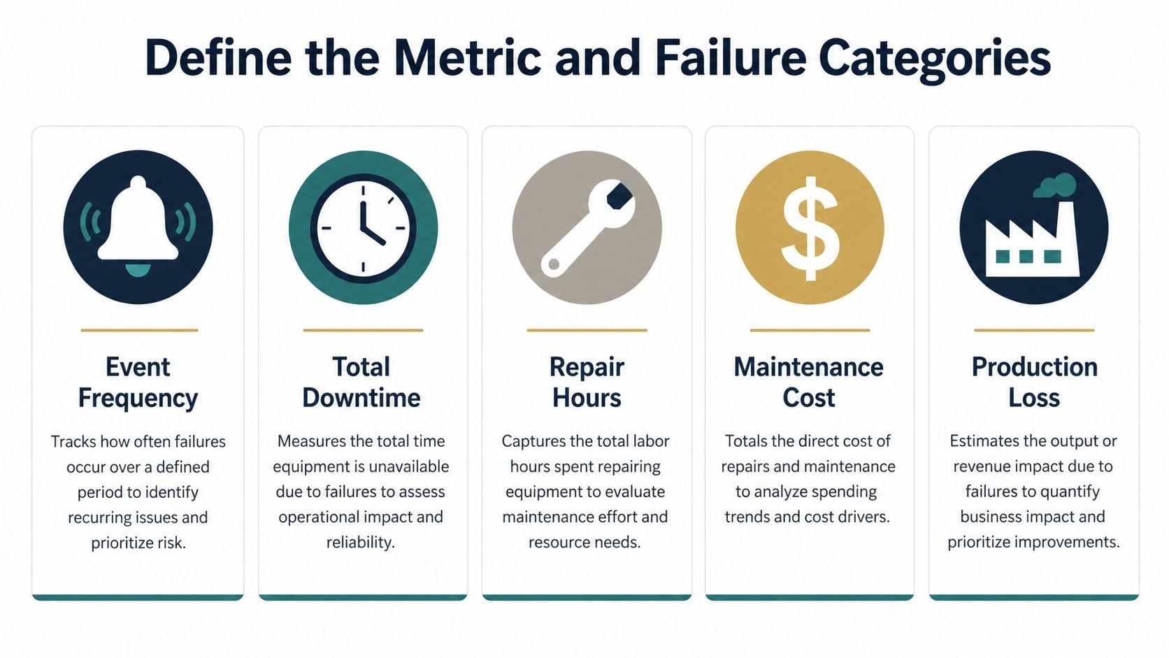
- Failure frequency, useful when repeated events consume planner and technician capacity.
- Total downtime, appropriate when availability and production continuity drive the decision.
- Repair hours, useful for identifying maintenance workload and access problems.
- Maintenance cost, valuable when labor, parts, and contractor spending need control.
- Production loss, appropriate when failure consequences differ sharply between assets or operating states.
Frequency, downtime, and cost can produce different priority lists. A seal problem may create many work orders but little lost production. An impeller failure may occur less often while creating long outages. Comparing these views helps determine whether the response should be FMEA, RCM, condition monitoring, or a targeted corrective action.
Practical rule: Build the chart around the decision the maintenance team must make, not around whichever CMMS column is easiest to export.
The classic framing is often described as the “vital few and trivial many,” meaning a small group of contributors drives much of the selected effect. Treat that relationship as a visual checkpoint rather than a guaranteed pattern. A pump population may distribute losses broadly, especially when equipment condition, operating state, and maintenance history vary across the analysis boundary. Use the cumulative line to identify concentration, then verify the finding against failure consequences before assigning work.
Define the Metric and Failure Categories
The strongest Pareto charts begin before charting software is opened. The reliability engineer first defines the population, the loss measure, and the failure taxonomy. Without those decisions, a visually polished chart can rank inconsistent records rather than real failure modes.
Start with the operational question. If the plant manager needs to select equipment for the next outage, downtime hours or production loss may be more useful than event count. If the maintenance manager needs to reduce technician workload, repair hours and repeat work orders may be more appropriate. If the issue concerns budget control, maintenance cost should be analyzed separately rather than blended with frequency.
Fix the boundary before collecting records
Define the analysis window and equipment boundary in writing. The boundary might cover one pump family, one process area, or all critical pumps. A fixed window prevents the team from mixing current operating conditions with historical records from a different production campaign, equipment configuration, or maintenance regime.
The categories must be mutually exclusive, meaning each event belongs to one category only. A practical pump dictionary could include:
- Mechanical seal leakage: visible leakage or seal failure confirmed at the seal assembly.
- Bearing failure: damaged, overheated, or excessively worn pump bearing.
- Impeller damage: erosion, cavitation damage, imbalance, or broken impeller material.
- Coupling wear: coupling element degradation, looseness, or misalignment-related damage.
- Lubrication problem: incorrect lubricant, contamination, under-lubrication, or over-lubrication.
- Instrumentation trip: a protective trip linked to a sensor, switch, transmitter, or control signal.
The dictionary should also define how the team handles unknown causes, repeated work orders, and minor categories. A follow-up work order for the same unresolved seal leak shouldn't automatically become a new failure event if the analysis is intended to count distinct failures. Planned inspections and preventive tasks should remain separate from unplanned failures unless the decision specifically concerns total maintenance workload.
Use an Other category sparingly. Small categories can be grouped at the far right, a practice included in university-based Pareto construction guidance from the University of Alberta, but an oversized bucket hides the causes the team needs to investigate. The category dictionary should be version-controlled and reused in later analyses, so changes in ranking reflect equipment behavior rather than changing labels.
For teams refining event definitions, a documented review of contributing factors can help separate the observed failure mode from the mechanism and underlying cause.
Clean the Data and Calculate Cumulative Impact
A CMMS export usually contains more ambiguity than the final chart suggests. Before aggregation, the reliability engineer should preserve the original export, create a cleaned working table, and record every transformation. That audit trail makes the analysis reproducible in a spreadsheet, a business-intelligence model, or a Python workflow.
The cleaning sequence should include:
- Filter the dates: Keep only records inside the defined analysis window.
- Confirm asset identity: Check that each work order belongs to the selected pump family or process area.
- Select valid events: Separate unplanned failures from inspections, planned lubrication, administrative corrections, and duplicate follow-up records.
- Normalize labels: Consolidate labels such as “seal leak,” “seal leakage,” and “mechanical seal leakage” into the approved code for mechanical seal leakage.
- Review missing causes: Assign a controlled unknown category for records that lack enough evidence, then flag those records for later review.
- Check exclusivity: Confirm that every selected record has exactly one failure-mode code.
- Validate the measure: Make sure downtime, repair hours, cost, or production loss uses the same unit and definition across records.
These checks address common root causes of bad data, including inconsistent definitions, missing values, duplicate records, and unreliable source entry. A chart can't correct a work order that records downtime as elapsed calendar time in one case and technician labor time in another.
Build the ranked calculation table
Suppose the selected metric is downtime hours for the pump population. The calculation table should contain the category total, the share of the grand total, and the running cumulative share. The values below illustrate the structure and use only the stated pump-failure example for calculation practice.
| Failure mode | Downtime hours | Percentage | Cumulative percentage |
|---|---|---|---|
| Mechanical seal leakage | 45 | 45% | 45% |
| Bearing failure | 30 | 30% | 75% |
| Impeller damage | 15 | 15% | 90% |
| Other | 10 | 10% | 100% |
The grand total is the sum of the downtime column. Each category percentage is calculated by dividing its downtime by that total and multiplying by 100. The cumulative percentage begins with the first ranked category, then adds each following category's percentage.
Sort the categories from largest to smallest before calculating the cumulative sequence, or calculate it only after sorting. If the rows remain in source-system order, the line won't show concentration correctly. The final cumulative value must reach 100%, as described in ASQ's Pareto guidance, because every included category must account for the complete selected effect.
Keep the source table intact
The cleaned record-level table should retain the work-order identifier, asset identifier, date, failure-mode code, selected metric, and any evidence used to classify the event. An aggregated table is useful for the chart, but the record-level table is what supports later diagnosis, FMEA, RCM, and root cause analysis.
A link to the plant's CMMS asset-management process should be part of the governance discussion. The chart is more valuable when planners can trace the dominant bar back to specific assets, failure descriptions, corrective actions, and recurring conditions.
Build the Pareto Chart in Your Preferred Tool
The charting environment matters less than the data model. Excel, Power BI, and Python can all produce a valid Pareto chart when they use the same sorted categories, aggregation rule, cumulative calculation, and axis structure. The software only accelerates plotting. It can't repair mixed failure codes, missing downtime, or a metric that doesn't match the maintenance decision.
Excel for a controlled planning workbook
In Excel, place the cleaned failure-mode table in a helper range with categories already sorted in descending order. Add columns for the category total, percentage, and cumulative percentage. If the selected measure is in cell B2 and the grand total is in a designated total cell, the percentage formula divides the category value by the grand total, while the cumulative formula adds the current percentage to the preceding cumulative value.
Create descending columns for the selected impact and add the cumulative-percentage series as a line. The bars should use the left axis for downtime hours, repair hours, cost, or another selected measure. The cumulative line should use a secondary right-hand axis scaled from 0 to 100%, with the final point at 100%.
A helper column is preferable to relying on automatic chart sorting. It allows the planner to inspect category order after filters, update the source range, and compare the chart against the calculation table. Excel works well for an outage-planning workbook when the category dictionary and validation checks are maintained alongside the chart.
Power BI for interactive asset segmentation
Power BI becomes useful when the plant needs to compare pump families, process areas, shifts, or operating states through filters. The model should aggregate the selected measure by failure mode, sort the category field by that measure, and calculate a cumulative measure over the ordered category set. A clustered-column visual can show the bars, while the cumulative measure appears as a line on a secondary axis.
Filter interactions need special attention. A category order that looks correct for the full plant can change after a pump-family filter or a process-area selection. The report owner should test the visual with each intended slicer and confirm that the cumulative line is recalculated against the filtered total, not against an unrelated grand total.
Power BI is valuable when maintenance leaders need a repeatable view rather than a static monthly file. It should still expose the underlying totals, category definitions, and last-refresh context. A dynamic chart can create false confidence if users can't see which records and metric produced the ranking.
Python for repeatable engineering analysis
Python provides a compact path for teams that need reproducible calculations across large exports. A typical workflow uses a record table, groups the selected measure by failure mode, sorts descending, calculates each group's share of the total, and applies a cumulative sum. A plotting library then draws the bars and overlays the cumulative series using a second vertical scale.
The engineering advantage is traceability. The analyst can preserve the cleaning rules, rerun the same logic for another analysis window, and compare rankings without manually copying formulas. Python also supports segmentation by asset family and checks for missing categories, duplicate work-order identifiers, and cumulative totals that fail to reach 100%.
Before publishing any version, verify:
- Category order: Bars descend from the largest selected impact to the smallest.
- Grand total: Aggregated values reconcile to the cleaned record-level table.
- Axis scaling: The cumulative axis runs from 0 to 100%.
- Labels: Failure modes remain readable and unambiguous.
- Endpoint: The cumulative line finishes at 100%.
- Filter behavior: Any selection or segmentation recalculates the chart correctly.
A Pareto chart can sit alongside Weibull analysis software when the reliability team needs to examine time-to-failure behavior after identifying a dominant failure mode. The two analyses answer different questions, so one shouldn't substitute for the other.
Interpret Priorities and Plan Corrective Actions
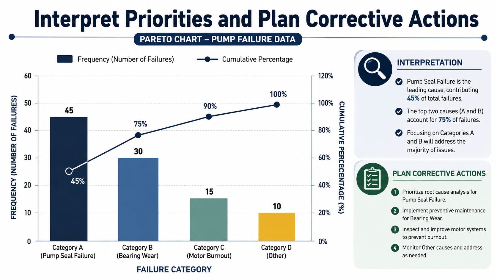
The completed pump chart should drive a maintenance decision and action plan rather than serve as a presentation artifact. In the example table, mechanical seal leakage contributes 45% of the selected downtime, bearing failure adds 30%, and the cumulative line reaches 75% after those two categories. Impeller damage raises the cumulative result to 90%, so the chart points toward an initial focus on the first two categories while keeping the third under review.
A practical interpretation starts by locating where the cumulative line crosses the 80% reference. The categories to the left form the first investigation group, but the reference is a screening aid, not an automatic work boundary. In this pump example, the crossing falls between bearing failure and impeller damage. The team should address seal leakage and bearing failure first, then assess whether impeller damage has enough consequence, recurrence, or cost to enter the same work plan. Monday's explanation of Pareto interpretation describes this cumulative-line approach.
Separate priority from consequence
A frequency Pareto and a downtime Pareto can identify different leaders. A seal leak may create many short interventions, while a rare coupling failure may stop the train for longer. Before assigning a work package, compare failure frequency, downtime, repair hours, maintenance cost, and production loss in the CMMS export.
Decision test: If the selected metric changed, would the same asset still be the first intervention?
Use the 80% level as a visual checkpoint rather than a fixed rule. Some applications show a distribution closer to 90/10, so plant data must establish whether losses are concentrated or spread across many categories. ScienceDirect's engineering reference on Pareto analysis also identifies risks from too few observations, an unrepresentative time window, overlapping categories, and an oversized Other bucket.
Match the response to the failure mechanism
Each leading category needs an owner, diagnostic method, containment action, and prevention plan. For the pump example:
- Mechanical seal leakage: Review installation practices, flush conditions, shaft runout, and operating pressure. Ultrasound or visual inspection may support a targeted route, after the team confirms the mechanism.
- Bearing failure: Audit lubrication quantity, lubricant condition, contamination control, and alignment. Vibration analysis can identify developing defects, while oil analysis may show contamination or lubricant degradation.
- Impeller damage: Investigate cavitation indicators, suction conditions, process changes, solids handling, and hydraulic operating point. A pump-performance review may produce a better response than a generic preventive-maintenance task.
- Coupling wear: Check alignment, soft foot, base condition, and coupling installation. A targeted alignment verification may be more appropriate than calendar-based replacement.
Use FMEA, failure modes and effects analysis, when the team needs to connect failure modes with consequences and rank risks systematically. A manufacturing-focused FMEA resource supports the transition from charted history to structured failure analysis. Use RCM, reliability-centered maintenance, when the organization must choose a maintenance strategy. Use condition monitoring when degradation can be detected before functional failure. Use root cause analysis when the same failure recurs despite corrective work.
Avoid Common Pareto Chart Pitfalls
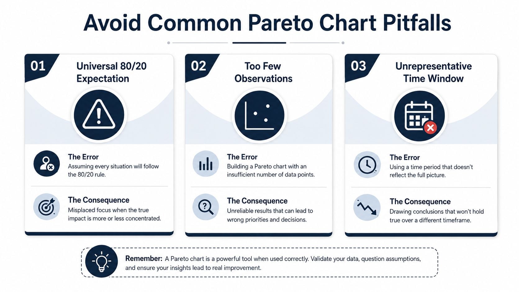
The most damaging Pareto error is treating the classic 80/20 relationship as a plant law. Some equipment populations concentrate sharply, while others distribute losses across many failure modes. Forcing every chart to produce a small priority group can make the team ignore broad design, operating, or data-quality problems.
Test whether the pattern is trustworthy
A chart built from too few observations can rank transient noise. A narrow or unusual time window can overrepresent a single process upset, commissioning issue, or temporary operating condition. The reliability engineer should test the result against a representative window and inspect whether the leading categories remain credible across relevant asset and process segments.
Overlapping categories create another problem. “Bearing issue,” “lubrication issue,” and “high vibration” may describe the same event at different diagnostic levels. If the team counts them as separate causes, the ranking becomes ambiguous. The category dictionary must distinguish observed failure mode, physical mechanism, and suspected root cause.
A quality-control review should check:
- Question and metric: Does the chart measure the decision the team needs to make?
- Source records: Are planned tasks, duplicate follow-ups, and administrative entries excluded appropriately?
- Totals: Do category sums reconcile with the cleaned work-order population?
- Exclusivity: Does every event belong to exactly one category?
- Concentration: Does the pattern support a meaningful intervention set?
- Action capacity: Can the team investigate and correct the categories selected by the threshold?
Challenge the Other bucket
An oversized Other category often signals weak coding rather than a harmless collection of minor events. Review its records, split meaningful failure modes into approved categories, and retain only small residual groups at the far right. If unknown causes dominate, the corrective action may be better CMMS data governance and technician diagnostic training before a major reliability campaign begins.
A cumulative line that doesn't end at 100% indicates a calculation, filtering, or inclusion problem. The team should stop interpretation until the endpoint, bar totals, and source records reconcile. A Pareto chart is a hypothesis about where reliability work should begin, not automatic proof of root cause.
Turn the Analysis into Reliability Improvements
A useful pump Pareto creates a repeatable handoff. The reliability team should record the selected failure mode, responsible owner, suspected mechanism, diagnostic technique, immediate containment, and longer-term prevention plan. FMEA or RCM fits a new maintenance-strategy decision, condition monitoring fits detectable degradation, and root cause analysis fits recurring failures that survive corrective work.
The team can use resource allocation optimization to connect ranked losses with available labor, outage scope, monitoring routes, and engineering capacity. After actions mature, rebuild the chart using a comparable definition and window to test whether downtime, repeat events, or maintenance cost moved in the intended direction.
Forge Reliability helps industrial teams evaluate critical pump and rotating-equipment data, clean failure histories, apply condition-monitoring methods, and convert Pareto results into targeted reliability actions. Visit Forge Reliability to request a free reliability assessment focused on reducing unplanned downtime and extending asset life.